Redesigning a proptech platform — and getting it into the world's biggest banks
How I led Kukun's design team, rebuilt every product from scratch, and helped land integrations with PNC, US Bank, and SoFi.
A powerful product held back by weak design
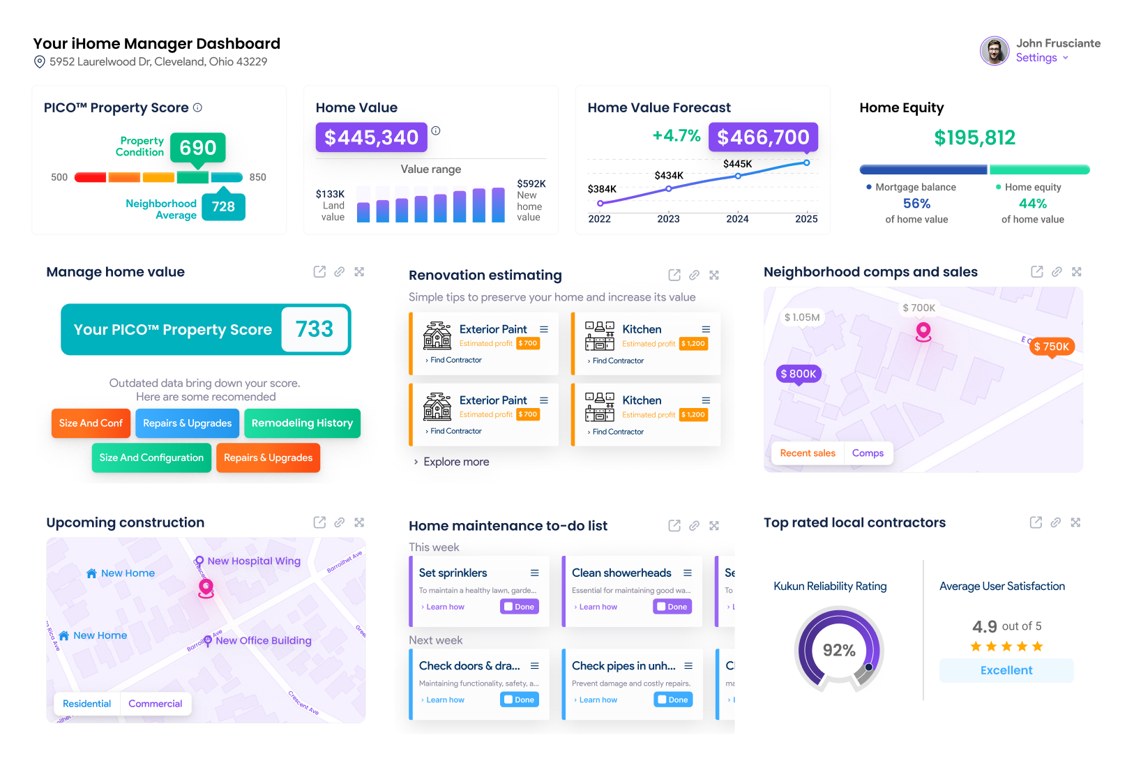
Kukun had built something genuinely impressive: a data-driven platform helping homeowners buy smarter, renovate profitably, and manage their home value over time. The technology — renovation cost estimation, permit data, ROI projections, home condition scoring — was deep and differentiated.
The design wasn't keeping pace. When I joined as Design Lead in late 2021, there was a team of three designers already in place — but the product experience was fragmented, the mobile experience was broken, and the visual identity wasn't strong enough to support the enterprise partnerships Kukun was actively pursuing.
My mandate, working directly with COO Scot Langmark: rebuild everything. Every product, the brand, the website — and prove through design that Kukun belonged in the same conversation as PNC, US Bank, and SoFi.
What I Inherited
A design team of three that wasn't functioning cohesively, fragmented product UX across multiple tools, a mobile experience that was largely broken, and a brand that undersold the quality of the underlying technology.
The Stakes
Kukun was in active conversations with major US financial institutions about embedding its tools into their platforms. The design had to be enterprise-grade — trusted enough for a bank to put in front of their mortgage customers.
“The technology was already good enough for PNC and US Bank. The design needed to earn that same level of trust”.
Four problems to solve simultaneously
Leading a design team is a different problem from being a solo designer. Alongside the product work, I had to diagnose why three talented designers weren't producing cohesive output — and fix that without losing momentum on the actual product.
A team that wasn't working
Three designers, inconsistent output. My first job wasn't to design anything — it was to understand why the team wasn't clicking, establish shared standards, and make one difficult personnel change to unblock everyone else.
Mobile was an afterthought
Kukun's core audience — homeowners planning renovations — lives on their phones. The existing experience was built desktop-first and never properly adapted. Making mobile a first-class experience meant rethinking fundamental interaction patterns, not just scaling down screens.
Enterprise-grade whitelist requirements
When a bank embeds your product in their platform, the design bar is different. It has to be clean, trustworthy, and adaptable to someone else's brand language. The Cost Estimator and iHomeManager needed to work as standalone tools inside PNC, US Bank, and SoFi — not just on Kukun's own site.
Expanding the product while rebuilding it
The brief wasn't just to fix what existed — it was to add new products inside iHomeManager. I had to redesign the existing experience while simultaneously designing net-new features, without breaking the system or confusing existing users.
From a generic identity to a system of its own
Before the rebrand, Kukun looked like every other proptech tool on the market: safe colors, a forgettable mark, a site that read like a template. My job wasn't to make it prettier. It was to build an identity, and a site, confident enough to sit inside a bank's platform and warm enough to still feel like it was made for a homeowner, not a spreadsheet. That meant working both layers at once: the mark itself, and every page it had to live on.
The mark and the system
The logo was the smallest part of the problem. The real work was building rules for color, type, and voice that could hold up across product, site, and physical events like conferences and booths.
- Generic proptech visual language, interchangeable with competitors
- No real point of view, just a safe palette and a stock-feeling mark
- Didn't hold up next to enterprise partner brands like PNC or US Bank
- Inconsistent application across product, site, and events
- A distinct, ownable mark built to work at bank-embed scale and on a phone screen
- A system, not just a logo: color, type, and voice rules that scaled everywhere
- Credible enough for a mortgage customer, warm enough for a first-time homeowner
- Consistent across every touchpoint, from iHomeManager to the booth signage
The full site redesign
The old site was where the generic identity showed the most: stock layouts, no clear hierarchy between the consumer product and the enterprise pitch, nothing that separated Kukun from any other SaaS homepage. I rebuilt it end to end, twice over the course of the engagement, so the site could carry the same weight as the new mark.
- Templated layout, no visual hierarchy between sections
- Consumer product and enterprise partnerships competed for the same space
- Copy and imagery did nothing to build trust with bank-level partners
- Navigation and page structure hadn't kept pace with the product
- Clear page architecture, separating the consumer story from the enterprise one
- New template system built for fast iteration as partnerships grew
- Enterprise credibility built into the design: partner logos, proof, clear CTAs
- Every page carrying the same voice and visual rules as the new brand
The brief wasn't "make it nicer." It was "make it trustworthy enough for a bank and warm enough for a homeowner." Those two things usually pull in opposite directions. The mark had to hold both. So did every page of the site.
How I led it
Team audit before product audit
My first weeks weren't spent designing — they were spent understanding the team. I ran design reviews, looked at how work was being assigned and reviewed, and identified where the breakdowns were happening. The issue wasn't skill — it was missing shared standards and unclear ownership. I restructured how the team worked, established a design system as the shared source of truth, and made the personnel change that had been holding everyone back.
Mobile-first redesign across all products
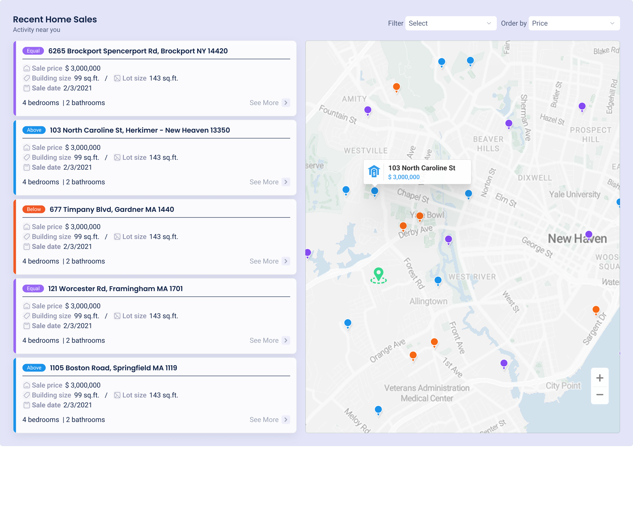
The most impactful single change I made was flipping the design priority to mobile. Homeowners check renovation costs, browse neighborhood permits, and track home value on their phones. I redesigned every core flow mobile-first — the Cost Estimator, iHomeManager dashboard, PrepToSell, neighborhood tools — and only then adapted up to desktop. This wasn't a responsive tweak. It was a rethink of the entire interaction model.
Building new products inside iHomeManager
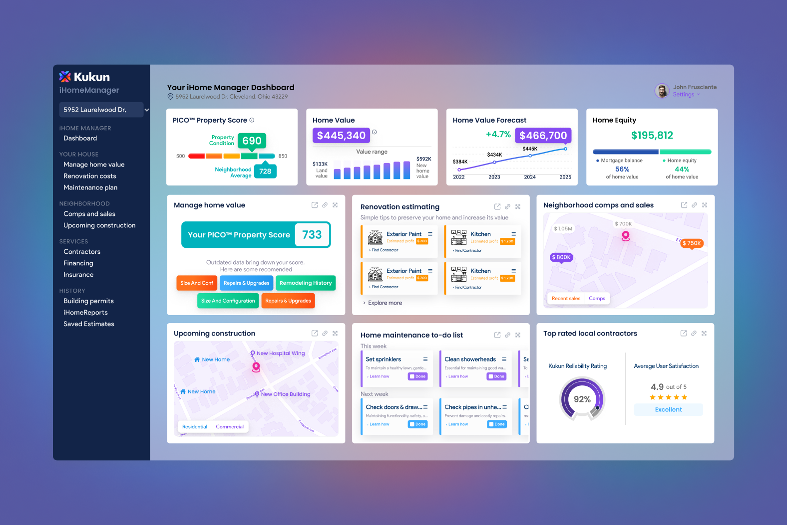
iHomeManager was the core of Kukun's consumer proposition. Working closely with Scot Langmark, I identified gaps in the product that users needed and designed new features inside the platform — expanding from a home value tracker into a fuller suite of investment guidance, maintenance planning, and renovation ROI tools. Every new product had to feel native to the existing system, not bolted on.
Rebrand and website rebuild
Once the product experience was solid, we tackled the brand. The existing visual identity was generic proptech — neither warm enough for homeowners nor credible enough for enterprise. I led the rebrand to create a system that could serve both audiences: approachable enough for a first-time homebuyer, polished enough to sit inside a bank's digital platform. The full website was rebuilt to reflect the new brand and the expanded product suite.
Enterprise partnership support
As Kukun entered partnership conversations with PNC, US Bank, and SoFi, I was part of those discussions from the design side. The banks needed to understand how our tools would look and feel inside their platforms — I prepared white-label design specs, adapted the Cost Estimator and iHomeManager for partner embedding, and helped the team present a design-ready product to enterprise prospects.
Physical brand — events and booth design
Kukun's brand presence extended beyond screens. I designed the physical installations for Kukun's event appearances — booth design, signage, branded materials — ensuring the same visual standards we built in the product showed up in the real world too.
From fragmented to enterprise-ready
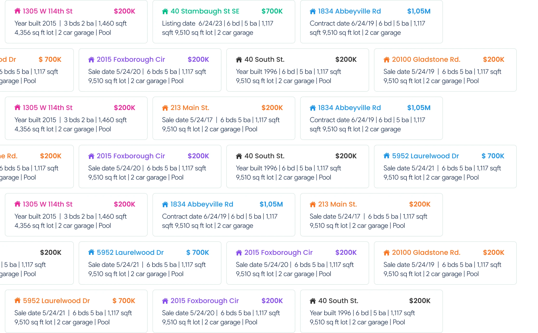
The redesign delivered two types of results: internal and external. Internally, a design team that had been underperforming became a cohesive unit with shared standards and clear ownership. Externally, the product became credible enough for three of the largest financial institutions in the US to embed it in their platforms.
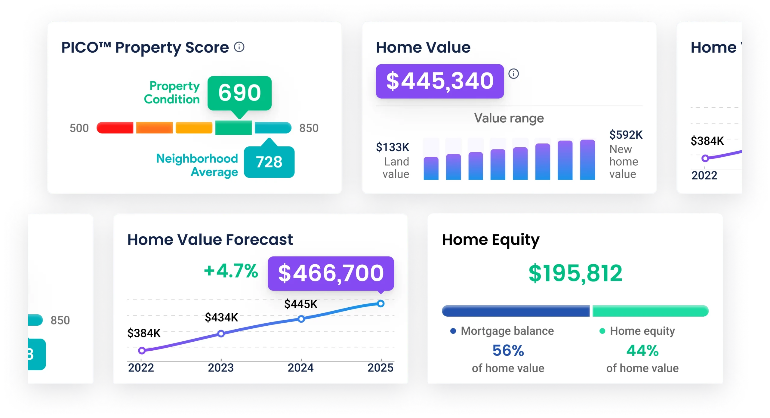
PNC, US Bank, and SoFi now offer Kukun's tools — the Cost Estimator, iHomeManager — directly to their mortgage and home equity customers. Those integrations happened because the product looked and felt like something a bank would trust. I was part of the design conversations that made that possible.
Key takeaways
- Leading a team means fixing the system before fixing the work. The three designers weren't producing great output because the conditions for great work weren't in place. Shared standards, clear ownership, and the right people in the right seats — those came first. The product quality followed.
- Mobile-first isn't a layout decision — it's a thinking model. Flipping to mobile-first on an established product revealed interaction problems that desktop had been hiding. Several flows that seemed fine on desktop were completely broken as soon as you had to do them with one thumb.
- Enterprise design is a different discipline. Getting your product into a bank requires the same rigor as getting it certified. Every edge case, every error state, every accessibility issue becomes a blocker. Designing for enterprise means designing for the most demanding version of your user's context.
- Designers belong in partnership conversations. The bank integrations didn't just happen because the product was good — they happened because we could show, in design terms, exactly how our tools would work inside their platforms. That made the yes easier to get.